
Graphic Design 2
The next chapter, graphics 2 is where the real work starts. Now coming off from the digital computer and into the real world we learn about the elements of art and typography. Using these skills we create infographics and poster but also experiment with adding designs to other mediums like vinyl and wood. Working with clients is also where graphics 2 gave me a kickoff for.


--
Wednesday Excercises
This is your Project description. Provide a brief summary to help visitors understand the context and background of your work. Click on "Edit Text" or double click on the text box to start.
01
Mini Compositions Poster
Size: 17 x 11 in
Medium: Adobe Illustrator
Description: Elements of art and principles of design are very important things in the graphics design world. In this poster, we took a simple shape from a random object and created mini compositions showcasing a principle of design. I took a magic mouse, and used its curves and semicircles to create a clean poster that's in front of you. To creatively present the compositions, I placed them inside a key on the keyboard, though if I were to do this again in the future, I would have put more emphasis on my compositions.


02
Vinyl Laser Cut
Size: 12 x 12 in
Medium: Adobe Illustrator & Vinyl
Description: This project had us using the laser cutter for the first time. I listening to an album, no lyrics, thought a bit... thought a little more... felt nothing... had no ideas... and then it hit me, Jazz! We had to listen to an album for this project and create a design that would be laser cut on a vinyl inspired by the music. To be honest, I didn't know what to think, so I did what I thought of what came to heart when I listened to Jazz. In the nights of New York city where jazz bands play and the steamboat willies shuffle to the danceable dixie jazz. Thats what I thought of and so that's what I did!
03
Veterans day Concert Poster
Size: 11 x 17 in
Medium: Adobe Illustrator
Description: This is a design of a poster for the Veterans Day concert at Arnold O. Beckman High School and performed by the school's marching band with the Tustin American Legion Post 227. The main theme was to create patterns based on the American flag and use them across the entire poster. I tried to create separation and movement in the poster by alternating colors from blue to red across the entire poster. This was the first poster for the school that we each made.


04
Wednesday Excercises
Size: 8.5 x 11 in
Medium: Adobe Illustrator
Description: Repurposing the designs used in the Veterans day concert poster, I created a cover for a student planner sold by Beckman for students to use. This is not an actual design on a cover however we learned to repurpose other art into other sources.
05
Mini Compositions Poster
Size: 8.5 x 11 in
Medium: Adobe Illustrator
Description: And finally the last project that I had to repurpose patterns for was this tru blu poster which displays all the tru blu traits of our school. The most prominent and unique part is the "Be Beckman" which I purposely intended to go larger than life for. My use of patterns was a little cheap though by using them as a background to the blue rectangles that display the traits.


06
Vinyl Laser Cut
Size: 19 x 7 in
Medium: Adobe Illustrator
Description: Again repurposing the patterns used in the Veterans day concert poster, I created a tru blu t-shirt design using the theme of those patterns. I designed the words "Tru Blu" on the front of the t-shirt to match with the theme of my patterns which use stars, rectangles, and diagonal lines. On the back I put the tru blu traits and used my patterns as the border.


07
Laser Cut gift mug
Size: 4 x 3 in
Medium: Adobe Illustrator & Wood
Description: As a special final project and holiday gift to my mom, I created a design with her name on it and engraved it on a wooden mug... which is why I know get to say officially that the laser cutter in room 803 laser cut a wooden mug for the first time, and it was my moms! I used a floral design with her favorite flower, the jasmine, and flowed it nicely around her name. She loved it! Now just need her to stop drinking so much tea...
08
Helvetica Font Poster
Size: 8.5 x 11 in
Medium: Adobe Illustrator
Description: Created as a beginning for our typography unit, I was assigned to create a poster detailing the infamous font Helvetica. A few things, this font is so famous that even a movie was made about it. So tasked with creating a notable poster for a very simple and ubiquitous font was interesting. Keeping as little to no possible things on the page I crafted a poster which gave your eye a journey to explore this font. The emphasis on the big "a" serves as a reminder to the distinct negative space "teardrop" that makes the font so widely used. For my efforts this poster was submitted for and won 2nd place at the Tustin Area Council of Fine Arts art invitational.


09
Alliteration Poster
Size: 11 x 8.5 in
Medium: Adobe Illustrator
Description: The second project in our typography unit, we show off some of the vocabulary we learn about fonts. We used an adjective that described ourselves and our name and then chose two fonts in which we them pointed out the anatomy and labels of each one. For me I chose "rusty" and used the idea of oxidization to highlight the part of the letter I am pointing to and determine its correct label.
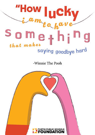
10
TPSF Gratitude Tote-Bag
Size: 11 x 17 in
Medium: Adobe Illustrator
Description: The Tustin Public Schools Foundations asked our class to design tote bags about gratitude, and who no better to express that than winnie the pooh. I went for a cute design which features the hand of pooh and piglet making a heart and a quote by pooh expressing gratitude.
11
Adjective Type
Size: 17 x 11 in
Medium: Adobe Illustrator
Description: Continuing the typography unit we made a quick poster that uses a font and describes it using a adjective. This helps with understanding font selection and the emotions and unconscious meaning a font provides in a design. I used doublebass which was quick to become one of my favorite fonts and I said it looked very crusin'!


12
Creation of Font
Size: 11 x 17 in & 17 x 11
Medium: Adobe Illustrator
Description: Here is Castle Sans! The font that I created in graphics 2. Grotesque, gothic, creepy, and scary don't fit my style at all but I tried something new. When I created my first letter I new that this font wasn't what I had envisioned a font made by me would look like. However painstakingly I kept with it and this is how it turned out! The bottom adjective poster is a wonderful way to describe my font: nefarious. On the bottom of this text is my tri-fold brochure which showcases my font and the inspiration behind it.


